Tuesday, 8 March 2011

Evaluation Sonia Routledge

In what ways does your media product use, develop or challenge forms and conventions of real media products?
 
To show the best points and aspects of our trailer that challenge products of real media, I have created a 3x3 “Art of the Title” table. I have take 9 screen shots which I think show similar ways to which any other trailer would be presented or shown.

Shot One.
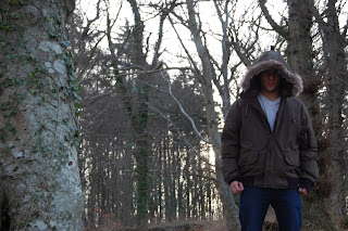
This is one of the final shots of the trailer. Taken at an interesting angle, I thought it was important to include. It is a shot of the main actor (Henri) and gives the idea that someone is looking up at him from the ground. It is difficult to see his face because the hood casts a dark image. In the background we can see the background of the light behind the trees which I think has a nice effect and a professional feel.

Shot Two.
The second shot I have put on my grid is of myself hiding from the killer I am running from. I think this is good and looks realistic because of the way it shows an actor standing above me. Something that could normally be quite difficult to capture. It’s a shot that says rather a lot about the genre of the movie, and a bit about the story line without giving everything away. This is essential and is usually noticeable in most popular trailers produced.

Shot Three.
This is one of my favourite shots in our trailer, it shows Henri the main actor, sitting up in bed, clearly startled by something. We can see that he is also holding a gun which adds to the suspense of the trailer. I feel that in movies and trailers it is important to not over complicate the shots and the editing. I like this shot because it is simple and sows a clear image. It isn't taken from a difficult angle and is easy for the viewer to see. Although the lighting is slightly darker than that of the other shots I don't think this is too important. It adds to the atmosphere being created throughout the trailer

Shot Four.
Although it is important in a trailer or movie to keeps things simple, it is also good to have a contrast of different shots for various different things. I like this shot of the gun because it is something you would be likely to see in a real trailer for a film, especially one of a horror or thriller genre. I think by showing the gun at this angle, it gives the viewer a real sense of what is going on in the movie and makes it feel much more lifelike. The angle is taken almost as if there is a person lying down and looking at the gun from their side. In the trailer, we are trying to make the viewer feel as though the story line is as real as possible and that they are almost there.


Shot Five.
Obviously this screen shot is of the title of the trailer. Something that has to be included in any trailer and that one is never without. Its important that the title of the move is clear to see and interesting to the audience that are watching. Its clarity is especially important because we want people to know what the movie is called so that they can go out and watch it. I think our title is very catching. It has a black background and white writing which makes it easy to be seen. There is also a blood stain/mark over the ”N” and the “C” of the Vengeance to give an idea of what sort of genre the film is. Usually most titles in trailers reflect the storyline or the genre of the film being presented. For example, a chick flick or girly movie is likely to have nice “simple” writing whereas and action or horror movie may be likely to include a gun or something along those lines in the background to add dramatic effect. When creating our title however we had to make sure that the writing wasn't too difficult to read because of the font. Although I think we managed to get it just right without making it too difficult for the viewer to read.

Shot Six.
This is yet another shot of the main actor. The image is an over the shoulder shot which shows him looking in the mirror, something slightly different to the other shots included in our trailer. At this point in the trailer we can also hear a distinct noise in the background which gets a higher and higher pitch as the camera angle moves around Henri. I think the image of the face in the mirror and the back showing gives an eerie look and is almost scary for the viewer and makes them slightly curious. This is another shot that you are likely to see in a professional trailer. It was important that when we were getting this shot we had the right lighting. I also like that the image is slightly distorted and that the whole of Henri’s face isn’t totally visible. We can see a dark reflection and we can also see the simple background behind him which again adds to the suspicion and suspension of the trailer.

Shot Seven.
The seventh shot is one of the many titles that we included in our trailer. It says simply “IT LOSES IT’S TRUE MEANING”. Like the title of the trailer it was again important that we made sure all the titles and words in the trailer were easy to read, understand and relate to. All of the titles we used were put together to almost sum up our story line without giving anything away. They were very to the point and didn't stay on screen for too long. This is something we thought would be good to have in our trailer because we didn’t have a voice over.  In a film with a genre like ours, the less speaking there is in the trailer, the more suspense is added for the viewers. It is also something that isn't included in a lot of other many professional trailers that makes it something quite different. Below you can see a trailer that also includes titles throughout like ours, and shows how they both play in a similar way.


Shot Eight.
 The eighth shot is one of myself lying on the ground in the woods. It is taken slightly from behind a tree, and when watching the trailer, we can see the camera slowly move out from behind the tree finally to show the full body shot, lying on the floor. It’s a shot that says a lot for the genre of the trailer and is almost letting the viewer in on part of the story. Obviously they can see that someone is dead although they don't know how she was killed, how she got there, and for what reason. This is another shot that you would be likely to see in professional trailers for movies of the horror or thriller genre.  Again this carries on with the pattern of relatively dark shots which we see constantly in our trailer. This is vital as we don't want to have some very bright and sunny shots, and then a dynamic change to dark and spooky shots.

Shot Nine.
This is my last shot in my grid and is one of the most important. As in any other trailer it is always vital that you include the credits at the end. Unlike the exact release date it is isn’t really optional to have some of the credits in. viewers normally like to see who the film has been produced by and which companies have been involved. It is also more interesting for them if they know some of the actors that are going to be present in the film as this is something that is particularly catching to an audience. By showing both production companies, the writers and the director, we have managed to include everything that would be present in a real media product.

Saturday, 5 March 2011

Vengeance Evaluation (Sultan Mackinnon)

1. In what ways does your product use, develop or challenge forms and conventions of real media products?


When my group came together we wanted to make the best A-Level Trailer product that we could possible produce. To do this we decided to undertake some research. We did this by watching various trailers with different genres. Then we talked about what genre trailer attracted us the most. After our discussion about, which genre we were going to choose we decided to go with teenage/thriller horror.
Then we analyzed three trailers they were “When A Stranger Calls, SAW and My Soul To Take”. We talked about the conventions that we thought we should include in a trailer. We came up with fast editing, confusing story (dew to the genre we picked), dark coloring, exiting cinematography, good background music that sets the mood, artistic and a cliff hanger so that the viewers are interested to see the actual movie.

I have made a 3 by 3 style grid to illustrate this in more detail. To make this as compact and detailed as possible I chose the 9 most important screen shots throughout the trailer and explain why I believe this.

Screenshot 1
I chose this shot, as I believe that the opening trailer scene makes a huge impact on the audiences because as soon as they see a person with a gun there are different thought processes going through the audiences mind. For example in “When A Stranger Calls” the opening is bright and there is a conversation between the two characters. This gives the sense that it’s a normal day, until the night approaches were all of a sudden mood, atmosphere, color and facial expressions change. With this screenshot this is what we tried to achieve, as we wanted variations of emotions flowing through the viewers. We also used a close up on the face with the gun to give a clearer image of what the character is holding, as it is dark and hard to identify what the prop is.

Screenshot 2
I chose this screenshot as I thought that many trailers with different genre used this kind of technique to allow the viewers to interact so that they get concentrated in a variety of content. Also I think that this is a critical convention in trailers as it allows audiences to pause and think about what’s going on and try and figure out a “puzzle” that’s why it is important to not give out too much information so that they keep thinking about that trailer and find themselves in knots. This shot is important not only because it allows audiences to think about what is happening, but it also allows a free flowing transmission between different scenes, therefore there aren’t any sudden stops to that specific scene but twist.

Screenshot 3
This was one of the most important screenshots I think as it introduces another character, which makes the trailer more exiting. Also it shows the characters expression and gives some of the storyline to the viewers so that they kind of have a picture about what is going on. If you look closely above the female character (Sonia Routlage) you can see a pair of feet. This illustrates the artistic side of cinematography, which a lot of teenage/thriller horror trailers contain. This just really adds to the excitement of watching the trailer so that the audiences do not get bored as at the end of the day that’s what trailer try and achieve. This would be a key convention for a trailer of our genre, therefore that’s what we tried to do and mimic.

Screenshot 4
I like this screenshot because our trailer does not have much action in it, therefore like most trailers we decided to add some action in it. If you watched the trailer it’s a sudden move so the audiences do not expect it and I think that’s one of the key conventions in a trailer where you add something unexpected, which makes the trailer more thrilling to watch.

Screenshot 5
I chose this shot as I thought that it was necessary to get the viewers more synced into the trailer. With many professional trailers they show or mention a death in horror/thriller trailers to back up the fact that the film is the genre it is. Also it adds some excitement into the whole project. If you watched the trailer the scene were Sonia is a corpse is very quick so that it shocks the audiences, again this is to build tension and show the unexpected. 

Screenshot 6
This is probably my favorite shot in the whole trailer as it looks great and artistic, also it has a mysterious look, which is what we tried to achieve throughout making this product. Using key conventions is important for a trailer, but I think using the environment is also important for example ‘My Soul To Take’ has amazing scenery in the trailer as they use the environment and its shadows, colors and so on. Therefore we tried to base our trailer with a variety of different professional trailers and pick out the most exiting and important parts in each of them, so that our product had the best practice from each of the trailer that we chose.  In most trailers they like to make their scenes look stylish by making the character look good in this case making the character mysterious, therefore I think identity of the character is a key convention.

Screenshot 7
If you look at our Film Poster and Magazine we built a theme on this screenshot as if you look closely the costume that he is wearing is identical to what he is wearing in the poster and magazine cover. Many upcoming films do this for example ‘Thor’, which is not even a horror/thriller genre film or ‘Clash Of The Titans’ that has already been released undertake these kinds of techniques, therefore we thought that we should theme our magazine cover and film poster as well. This is why I thought this screenshot was important as the key convention of a trailer can affect other external things like the poster and magazine cover.

Screenshot 8
I chose this screenshot because when I watched trailers with different genres all of them had a title either at the beginning middle or at the end of the trailer. So obviously this was a very important convention that had to be featured, therefore my group came up with a title and created a font that suited our genre of our trailer.

Screenshot 9
This screenshot is nothing exiting but I thought it was important as it gave information about the film like who distributed our film, which studio it was produced, who the actors/actresses are and so on. This information is shown in every trailer so it was really necessary for us to also include it; therefore I thought that this was a key convention and an important screen shot.

2. How effective is the combination of your film trailer and ancillary texts?

To answer this question I have produced a video vlog that is around 7 minutes long. I talk about how effective our three products are and compare it to another film called 'Thor'. I have embeded the trailer for 'Thor' to show and illustrate my thoughts to these products.


3. What have you learned from your audience feedback?
As you know we had to upload our trailer in ‘youtube’ and ‘facebook’. We did this so that we could get feedback from audiences around the world, friends and classmates. This was very helpful for us as we got to find out what people thought about our product and how they affected them. You can find our video through this link http://www.youtube.com/watch?v=EitUAA2UBXg. There has not been a lot of views as we just posted the trailer on the website. The countries that have viewed the product the most have been firstly form the UK then USA, Canada and France. The video was most popular with teenagers aged between 13-17, which was our primary target therefore it was successful in that concept.
To get more accurate feedback we thought that we should get a live comment on our trailer, therefore myself, Henri and Sonia decided film our classmates commenting on our video. There were more positive notes than negative, which was very reassuring. The negative comments that were given by our classmates were very accurate as we thought the same thing they did before we interviewed them for example the warning at the begging about piracy was American, this fault was due to our error of research. Another criticism that we also thought was good was the fact that we didn’t center our writing in-between the scene, but apart form that our classmates thought the trailer was good and would recommend it to others.

4. How did you use media technologies in the construction and research, planning and evaluation stages?

To answer this question I have made another vlog to explain what we did and how we used our technology to produce the products that we have now. The video is about 10 minutes, I dont only talk about technology like Adobe Flash Player 2.0 or Photoshop CS3 but also the internet and how we researched through it by using things like google and youtube.


Posted by Sultan Mackinnon
Candidate Number 3641


Friday, 4 March 2011

Evaluation Henri Yueksel

TASK 1.

Screen shot grid 3x3, I will use the screen shots to compare our Trailer to a real media product.

Starting from top left to bottom right...


1.
The first screen shot is introducing a character, this is right at the start of the trailer, and gives us a brief idea about what the trailer is going to be, which type of character(s) are going to be included and as well show us the emotions of the different characters.
This shot is very significant as it is the first of the Trailer and already tells us a lot and sets the ambiance for the trailer. The scene doesn't have a lot of color, it is more black and white and you can see the character pointing a gun at his head, like he is thinking about to kill himself while looking in the mirror. This is basically what a trailer should contain, short scenes which tell a lot just by looking at it, for example the first shot already tells us a lot, even though it is just a still picture, it already wakes up emotions in certain people, for example when I showed this trailer to my mother, she was shocked as she saw me holding a gun to my head, even though it is a fake gun and I am just acting, it can make people feel like it is real and get them into the right mood and tension you are trying to achieve.

2.
The second shot is introducing a location that could be the main location where the story takes place or it could just be a significant place that gives the audience a whole idea of the type and mood of the trailer/movie.
This type of trailer doesn't contain any spoken parts, that's why the location and pictures shown have to have a huge impact on the audience, just by making them see the different shots and scenes. This scene for example shows a slow walk of, presuming the same character, as this scene comes right after the first shot, it brings back up the same mood and a slightly depressing feeling seeing this colorless and empty forest. It is very difficult to describe the emotions of the yourself or the audience while watching this or a real media Trailer. If the trailer is able to create emotions in the audience then it means that the trailer has achieved it's purpose, after that the question comes if the audience likes those "emotions" or not.

3.
In this shot a second character is introduced, the characters introduced after the first one that is usually the main character, are often secondary characters and aren't as important as the main character but have a big impact on the actual story. Here you can see a girl trying to hide of somebody in the same forest as the second shot, this is the part where the different scenes and shot are getting linked together and start telling a story, by summarizing it in form of a trailer.
In a real trailer (e.g. Saw Trailer) the main character is introduced at the beginning and a lot of other characters are shown in the trailer but aren't as important, this is shown by the different angles taken etc. that let specific characters shine out of the scene/trailer.  This shot starts telling us the beginning of the story and the plot.

4.
Here you can see the (main) character waking up in bed and pointing his gun at something, probably something he dreamed about. There is obviously something following the main character, a thought, a bad memory, this is up to the audience what they think the character is thinking of right at this point.
The gun is very significant throughout the trailer, it describes the character, he carries his gun around everywhere he goes, even when he is sleeping his gun rests underneath his pillow. This is where the thrilling part starts, the more exciting part after the introduction. Obviously something happened but we don't know what...
The trailer should "ask" the audience a lot of questions, this is basically what makes people want to see the movie, leaving gaps in the short film (trailer), cliff hangers etc. People will have to see the whole movie to be able to fill in these gaps and see the ending and the full story.

5.
This is a close up shot of the gun, it is the third time that the gun has been shown in the trailer. This gun has a very important role in the story and is telling a lot about the storyline and the character himself. The character is scared about something, even though we could imagine him being a violent person, while seeing him chasing after a girl.

6.
This is the girl that we've already seen in shot Nr. 3, she's lying in a ditch unconscious or maybe dead we don't know. She's got no blood on her neither scratch marks. With this shot we tried again to make the audience think about what could have happened to her and who actually did this to her. Is there a third person involved in the story? A Ghost? And again we don't know, this will be told in the full movie/story.
The scene is happening in the same forest again, these cross shots between the girl and the main character are trying to link these two characters in a very special way. The shot is taken from a high angle, like somebody is watching her, probably the person or "thing" that did this to her, hiding behind a tree.
Although there are a few shots with the girl, the scenes are very short from 3s to 0.1s, this is because we don't want to give away too much of the story.

7.
Adding text between scenes in a trailer is very popular amongst newer trailers, it basically summarizes the story in only a few words. This makes it easier for the audience to understand the trailer especially when there are no spoken parts like in our trailer. We mainly concentrated on the music, the different shots and the text shots (see pic.7).
This method helps telling more than only a few scenes would do, and is more precise, best combined with scenes, to make a story more vivid and thrilling/exciting.

8.
This is the last shot before the final title and credits come up. This shot is as significant as the first one of the main character pointing the gun at his head, because it tells us that this person is (going to be) very important and play a big role in the story, it is filmed with a low angle shot that adds more focus on the character.
The shot clearly shows that something isn't right with this specific character and focusing on the character adds more importance and effect to it as already described. The picture and the ambiance are still very dark and it is scary to see the character standing there looking down on something, probably the girl or maybe he is watching something or someone else, it almost looks like he's staring at the audience, what makes it a perfect cliffhanger, because the audience feel like they want to know who this person is and what he is up to even though he looks very scary and dangerous. This is one of human's instinct, usually when you hear noise in a dark place, instead of running away you try to find out what it is, even though you are absolutely terrified.

9.
And of course for last but not least the main title! I think that the title of a movie has a huge impact on the audience because it is basically a summary of the whole movie including the film and the music as well as the acting etc.
The title has to be right and look very sophisticated, but it doesn't have to take over the whole trailer, that's why we and most of the trailers now a days put their title at the end of the trailer to make it more thrilling/exciting, you actually have to wait until you can see the trailer even though you already know title. If you put the title at the beginning it is basically setting a starting point of the trailer and is ending with the credits, if you put the title at the end the introduction in the trailer is much smoother and you don't know when it's going to end, so it is more of a shock effect when the trailer ends and reinforces the cliffhanger effect.

Summary

We tried to make a trailer very identical to a real media trailer but including our own signature with different shots and editing as well as the background music, to make it very "special" and give one of many points to the audience why they should go and watch our movie!
Every single of the screen shot listed above are key shots that are creating different ambiance and trying to create as much emotions as possible in a very short period of time.


TASK 2.

This is a video explaining the links between the trailer, the magazine cover and poster. This is the first time I had to make a video log (vlog) and I realized that it isn't easy at all to sit in front of the camera and talk while keeping focus on the main question.
I uploaded the Poster and the Magazine Cover again so it is easier to refer to it while watching the video.


Magazine Cover


Film Poster


TASK 3.


Feedback Evaluation


YouTube Feedback

First of all I uploaded the video on YouTube, but it doesn't seem that many people had a look at it because we only got about 60 views, most of them from the UK as well as a few from Switzerland, France and the USA, as I showed the trailer to my family and friends living in these countries. The average age group that has seen our trailer is from 13-17, probably other students that are trying to find ideas and inspiration while watching others work on youtube.
I am going to link our Trailer to my own videos to try and get more views from America and other countries.
Through linking our Trailer to my other videos we might be able to get comments and feedbacks from other people that we don't know, this would be very useful and is usually totally different from the feedback of classmates or family and friends.

Link to "Vengeance" Trailer on YouTube

Facebook Feedback

The video that I posted on Facebook had much more success, as my whole family and friends shared it and commented on it giving a lot of positive and useful feedback. Especially my close friends are sharing this video with their friends and so on, that means quite a lot of people have seen, or will see our blog and our Trailer.
This method of "spreading" our work is quite useful but it won't make a huge impact on viewer numbers, because not as many people will see the trailer as if there would be advertising and publicity all over the world for example like a Hollywood movie such as Avatar etc.
I will create as well a fan page for our Trailer and A2 work on Facebook and hopefully get a lot of followers, even though this will be hard to achieve!


Classmates Feedback

As you can see I uploaded a video of our classmates feedback. Most of the feedback were really good and helpful and we got a lot of positive feedback, maybe they all just wanted to be nice but I'm pretty sure this wasn't the case.
Some of the feedback given helped us to improve and understand what we have or could have improved and will help us for our future productions.

Link to Feedback Video


TASK 4.

In this video I am talking about the use of technology during the coursework, where we used programmes such as Premier Elements 2.0 for editing our main task, Photoshop CS4 for our Ancillary Texts (Poster and Cover) and many other Technologies.


Premier Elements 2.0


Adobe Photoshop CS4


Written by Henri Yueksel
Candidate Number 4450


Thursday, 3 March 2011

Feedback Video


Sorry for the bad quality, I had to make the video smaller to be able to upload it on the blog

by Henri Yueksel (4450), Sultan Mackinnon (3641) and Sonia Routledge

Wednesday, 16 February 2011

Official and Final Poster and Magazine Cover

Here is the updated and finished Magazine Cover and Poster. In my opinion the end product looks more professional and mainstream like (compare to "Empire" and "Total Film" Covers) than the first attempt of the Poster and Magazine Cover.

Magazine Cover


Film Poster


Written by Henri Yueksel
Candidate Number 4450

Thursday, 10 February 2011

Important Note! Concerning Film Magazine Cover/Poster

After finishing our film poster and magazine cover, I uploaded everything thinking it would be really good. But I realized that we had to do a "real" mainstream film cover/poster and not our own creation even though I think the first attempt for a poster/cover went really well and I still really like both.

I am going to redo both, poster and cover to match the characteristics of a mainstream film magazine like "Empire" or "Total Film".


Even though we will redo the poster and magazine cover I will leave the recent posts up with the first magazine cover and poster, just as an inspirational fact.


Written by Henri Yueksel
Candidate Number 4450

Wednesday, 9 February 2011

Vengeance Movie Poster (not final poster!)

Text Added: This is not going to be our final Poster, but I applied the same methods for our final Magazine cover and poster. 

Here is our Poster, it has a similar style to the magazine cover and we think that the result is really good and that we achieved what we wanted.

The first thing I did was taking one of the Photo's Sultan Mackinnon took of me and started editing it like I did with the magazine cover.


We all agreed that this was the perfect poster of a poster, instead of the usual vertical poster we thought we'd make a horizontal poster, even though nowadays no more horizontal posters are produced, or very little, usually they all look the same (Hollywood mainstream) that's what we wanted to avoid, we didn't want a cheap copy of a typical Hollywood movie. Instead I took inspiration from the poster of "The Italian Job" (see picture below).


And here is the final result of our own Movie Poster. As soon as you start inspiring yourself from other posters, it is very difficult not to copy it one to one, I tried my best not to make it look exactly the same as "The Italian Job" poster even though it is an epic movie and an amazing poster (imo).


Written by Henri Yueksel
Candidate Number 4450

Tuesday, 8 February 2011

Magazine Cover (not final cover!)

Text Added: This is not going to be our final Magazine cover, but I applied the same methods for our final Magazine cover and poster.

Today we finished our Magazine Cover starring our Film (Trailer). I will explain how we created the magazine cover in several steps.

First Step:

First of all Sultan Mackinnon had to take several pictures of me (actor) in the woods close to our classroom and then we chose best picture for our magazine cover.


Here is the unedited picture that has been taken in the woods by Sultan Mackinnon...


Second Step:

Because the character (me) isn't centered in the picture I had to cut it out to have a bigger and centered character like a professional magazine cover. It was quite hard to find a good size of the picture that but I think it went out well. After I cut out the picture I added a Filter to the picture to change the whole picture's look as shown on the picture below.


Third Step:

The first thing that I concentrated on was the main title of the magazine. I found a very good site with plenty of amazing fonts, I downloaded a few and tried them out and used some of them for the magazine cover ( www.1001fonts.com ).

We wanted that the character shines out and that the title would be secondary next to the main character in the picture. So I cut out the head of the character with "Quick Mask" on Adobe Photoshop and added the title to the picture. After I added the title I just reinserted the head that I cut out before, this is the why it looks like the character is infront of the Font.


Adding the Main Title


Head, cut out with "Quick Mask"


Step Four:

To get some ideas I looked around the internet to find "horror magazines" and found a very good site www.rue-morgue.com , containing some really good magazines and I found a lot of inspiration to start with our magazine cover.


Final Result:

And here is the finished magazine cover, we tried to keep it as simple as possible with not much text to focus on the main Movie "Vengeance".


Written by Henri Yueksel
Candidate Number 4450

Vengeance Trailer


Here is our Final Media Trailer "Vengeance".
It wasn't easy but we finally completed all the editing and found a fitting soundtrack. Enjoy!


Written by Henri Yueksel
Candidate Number 4450

Thursday, 3 February 2011

Film Trailer

Henri, Sonia and myself have finally finish our movie trailer and will be posted up soon. In our first draft people said it was slow and did not have logos of our distribution and our production company, therefore we designed a logo for our production company. Many of our scenes took too long and in many ways gave a lot of the story away. So as a group we wanted our trailer to be random so to really understand the story behind the trailer you must watch the movie. The team made the scenes in the trailer much faster and the editing was much more fluent. The music that we put in was great to our story due to the confusion and the soundtrack fits in well with it as it has a repetitive beat, which in many ways is disturbing which increases the suspense and tension.

We will soon upload our movie trailer.

Posted by Sultan Mackinnon
Candidate Number 3641

Tuesday, 18 January 2011

Insperational Trailers

Through the course of the holiday there has been various films trailers released and as our film is based on fiction and thriller I chose a few trailers that had given me ideas of what we could include in our trailer:


The reason this trailer inspired me is because it attract the audiences. When I first saw it I was really interested on the film and ended up watching it. The trailer also contains what majority of teenagers would like to see (which is our main target audience) such as the actors/actresses, story and suspense.


The reason I choose this trailer is because it is a typical film that a teenager would like to see on a Friday night with her/his friends. Also the editing throughout the trailer is fast and keeps the audience attracted to the trailer, the music fits in well and the synopsis of the trailer and most importantly it is easy to understand.

Posted by Sultan Mackinnon
Candidate Number 3641